It’s odd, today I just posted in a series on WordPress for Beginners how to change your theme. John Chow yesterday hinted that he was about to change his theme on WordPress.
Well, John Chow has brought out a new theme for his blog, it’s official today, and I must confess, I liked the preview but I HATE the final version. It’s rare for me to blog about someone else’s theme (but I’m sure that’s part of John’s plan: to get comments and feedback… hehe! Evil, really evil!)
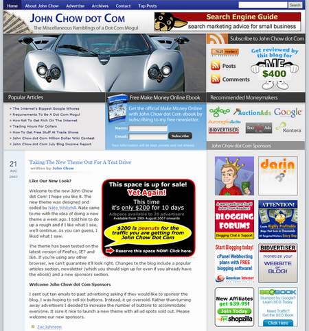
That’s not that I hate anything individually in the blog, the colors are fine, the layout is overall not bad, and the images are plentiful and gorgeous. It befits a website (in some respect) as it’s built for the future. But as a visual improvement, it comes at a cost: bandwidth, time and usability.
1. I saved the entire frontpage to disk to measure the amount of space that it would take. Answer 2.3MB. Though that includes the wonderful Tandoori meal he had (but even they were only 60K EACH!) It takes longer to load, and on some connections will be way too slow. On dialup as most of the States still is, it would be excruciating to wait for the front page to download. True, subsequent pages would take less time, though. But that’s a huge initial hit. It would take over 5 minutes and 47 seconds to watch that first page load!
2. The top of the page that runs from Home down to the first Date is all I see on my screen. I barely get a title of a blogpost. Instead, I get a major picture, a bunch of articles I already read, numerous affiliate schemes on the right, which I know about; and the RSS Feeds (I get). This is no wonder that John Cow writes “No wonder one of the two sports cars had to go, they ran out of parking spots.”
John Cow goes on to write:
And on that point, I think John Cow is wrong. The usability experience of his blog has been pushed to the extreme. As on my 1020×768 screen, I barely see anything worth using, and I know that 54% of my viewers use this or less! Can you imagine what you see on on smaller screen? It’s likely that unless John changes the top heavy part of the screen that I will not be as frequent a visitor as in the past. I don’t doubt that he will be able to bring in extra cash with the extra spots, but I’m afraid that he will increasingly drive away regulars for a variety of reasons, especially usability reasons – bandwidth, monitor space, and heady images!
3. Increasingly the weight of affiliates, sales, links and text ads is beginning to make the sell ‘oversell’. Are you selling Sizzle or Steak? I wonder increasingly that you are doing your blog a disservice. Of course, you set out to push the envelope in terms of money making ideas and experiments. I’m sure this new theme is part of that process, too. But now I’m beginning to wonder if you are pushing a little too far. Darren Rowse renewed his theme, and though it looks a little staid by comparison, it’s much more user friendly. Take a look and see what I mean!
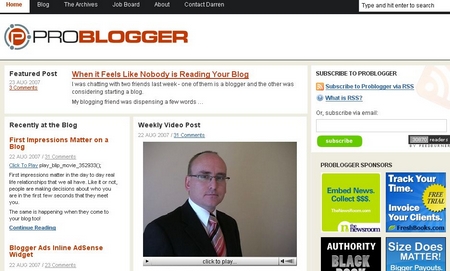
That’s pretty much how I see it on this screen. I have adds on the left, but I also have content that I can go to: three posts with descriptions on two of them AND a video. Of course, the more content I can find, the more chance you have to show me ads that I can read and click on. But if all I see is huge graphics files that take 5 minutes to download, I might very well click away before I even see anything. Now compare this with what I see on John’s blog now:
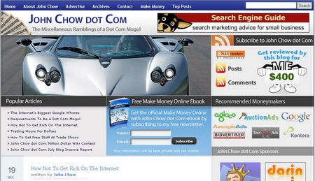
Visually, John’s does have more impact, but I wonder which one generates longer visits on the website. Moreover, as 2/3rds of readers tend to read their entire articles ONCE they decide to read something, good design should make it easier to find good articles by giving clues on the content: descriptive titles and summaries. Why make it hard for readers to decide these things?
I could make some suggestions. John, I think your BLOG is great, but your design is way over the top for the reasons I outlined here. Please, put your readers first! And get some regular visitors to test out the usability and effectiveness of your new design, and do check up on those who access via other means: mobile or dialup where bandwidth is still a premium price. So, in three words, TONE IT DOWN!